Editor's Note: the writer Zhang Xu, millet payment service user experience designers, authorized network of Lei Feng (search for "Lei feng's network" public concern).
With Samsung on March 29 launched Samsung wise to pay Samsung Pay business, Apple and Samsung, two international smartphone maker has begun to enter China Mobile payments, started trying to erode by Alipay and micro-payment services under the line of the letter monopoly, and subsequently led to a large wave of smartphone makers in China to follow up, China's mobile payment into warlords divided the warring.
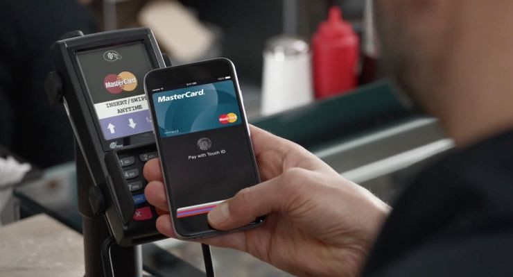
(Apple Pay payment scenarios)
Offline payment service in the Chinese market can be divided into two categories: one that is micro-letter to PayPal and paid for on behalf of scan codes; one of the NFC represented by Samsung and Apple Pay Pay pay.
Due to PayPal and micro-letters with third party payment license scanning code: pay was actually a line of quick payment, by line scan code validation to complete. Apple Pay and Samsung Pay is still essentially an alternative credit card offline credit card payment method.
Because of the first-mover advantage, as well as PayPal and micro-letters through huge investment and operation of the occupation of the user's mental resources, scan code payment method has been increasingly accepted and used by the public, has become the most dominant mobile payment method.
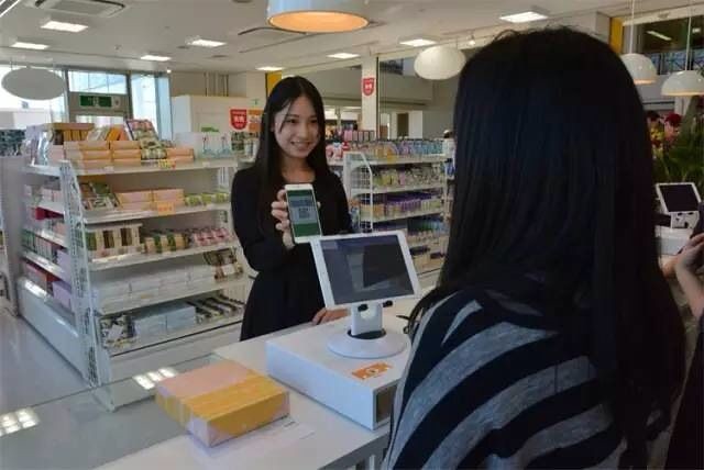
(Micro-scanning code to pay scenario)
Scan code payment and NFC payment
Obviously today's two paid domestic scan codes on behalf of PayPal and micro-letters, compared to NFC payments, they pay the action path for scan codes to be complex:
PayPal full standards process can be decomposed into 6 steps: unlock screen-see the app--open app--payment icon-scan codes--(non-micro-payment password is required from key) to complete the payment.
Micro letter full standards process the same, can be divided into 8 steps: unlock-find app--open app--click on the lower right corner of the screen + or my Tab--payments or purse import icon-sweep--payment code--(non-micro-payment password is required from key) to complete the payment.
On the surface, micro-scanning code steps a little more than PayPal, but because of the app based on the social cohesive, in an open position or resident in the system background, so in "find app--open the app" these two very experienced steps can be omitted, in General, slightly better than PayPal.
Anyway, the scan codes to pay path is complex, it is not the complexity of path number of steps, but in the path selection and memory. Scan code processes each route needs to be identified and determined, and NFC payment users without too much thought.
NFC payment on behalf of Apple Pay with Samsung Pay although paid on the underlying principles are the same, but Apple and Samsung considered NFC payment processes are not the same:
Apple Pay official recommended standard process (from the official video presentation):
Mobile phone users will directly close to the POS machine, mobile sensing and bring up the card interface;
According to the text on the screen prompts, fingerprint verification and payment;
If the user has paid in Bank passwords and the deal is not small visa free key require the bank payment password is entered in the POS machine;
Signing to complete the payment.
Samsung Pay official recommended standard process (from the official video presentation):
Out or Home screen interface, users first in gesture sliding screen to bring up the bottom of the screen from the bottom to top is already set as the "easy pay" card interface;
Through the horizontal sliding screen card;
According to the text on the screen prompts for authentication (including fingerprint authentication or password authentication);
User authentication is complete, close to businesses enter for consumption complete credit card POS machine;
If the user has paid in Bank passwords and the deal is not small visa free key require the bank payment password is entered in the POS machine; Balenciaga case for iPhone 6 plus
Signing to complete the payment.
Officials suggest Apple Pay process more convenient than Samsung Pay, this is due to the user when using the Apple Pay no additional gestures and moves to produce extra actions, so Apple will Pay the whole payment process designed to minimal levels.
This minimalism can be as simple as you just need to understand that support for the Apple iPhone is a Bank of Pay cards:
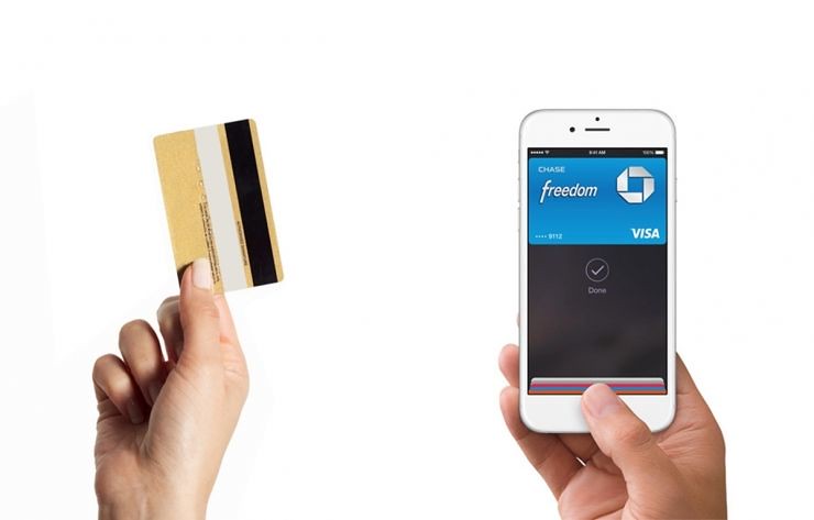
(Conceptual model – Apple Pay to pay bank cards)
Card-holders hold the phone close to the POS machine;
Identify card – validation passes, Token to the POS machine;
Payment password;
Sign the Bill complete.
Result of Samsung Pay similar authorization form, regardless of the type of process, than Apple gestures that Pay an activation card interface, and must be verified before you can close to the POS machine, otherwise, any changes are likely to cause POS machine error: Samsung Pay not directly as in Apple Pay before authentication near the POS machine.
Samsung seem to Pay a little paranoid at this point, perhaps to deliberately circumvent Apple's design. However, redeployed from the Samsung Pay so much emphasis on the first card interface, it is hoped that binds many card users to express themselves which credit card to use for payment, after you confirm the card again for verification. Brush entities this way is very close to the actual card.
Well, Samsung Pay concept is more like a typical purse:
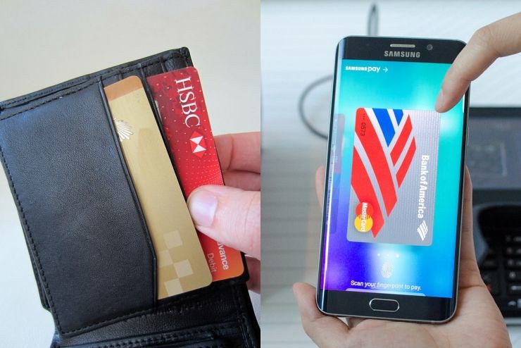
(Samsung Pay-pay concept model-purse)
User shortcut to bring up open wallets--first card interface;
Find card-sliding screen card;
Determines if this card-authenticated and ready the Token card (temporary card number);
Card – the mobile phone close to the POS machine and transfer the Token;
Payment password;
Sign the Bill complete.
By comparison can be seen, Samsung restore the users Pay the whole payment process complete process of having credit card wallet, may have this restored some, and can easily become the focus of debate.
Through many situations through practical experience, however, is a "purse" this is more clear and practical, which may be why Apple Pay still double-click the Home button to quickly bring up the card interface is also used in great causes.
Regardless of the choice of concept models, wallets and bank card payments to user behavior is a natural mapping for relation, help to help and guide users to pay to continue to the next step in the process, and therefore do not need PayPal and micro scanning code needs to put on a large scale paid to education and habits of the user.
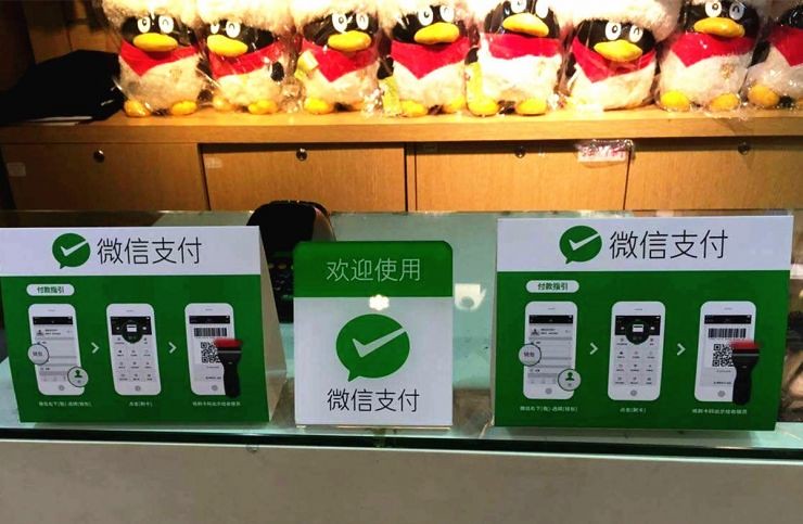
(Micro-scanning code to pay users to display)
Samsung and Apple Pay Pay
Compared to paying the conceptual model, Samsung Pay seems to be our true pay scene. And Apple Pay card layouts, chekanovskogo efficiency design details, such as the whole is better than the Samsung Pay:
Card layout
Compare Apple Pay chekanovskogo the Middle State, Samsung Pay chekanovskogo interface in the global identification cards may be affected to a certain extent on the degree of impact:
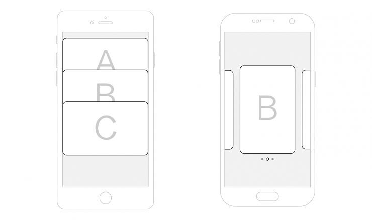
(Samsung and Apple Pay Pay chekanovskogo form)
Due to Samsung Pay in Cecca interface Shang to round broadcast (that Carousel, but and not end cycle) form rendering, and a screen only displayed a Zhang main card, user has cut card needs of situation Xia may cannot fast positioning by needed card in global of specific location, to through adjacent card allowance displayed or attempts to around sliding screen to one by one confirmed, to has may increased additional of identification and operation cost.
Chekanovskogo steps
Samsung and Apple Pay Pay have their pros and cons, lies mainly in the layout design of the respective kaliebiao. Like the Apple chekanovskogo switching any cards Pay only two steps:
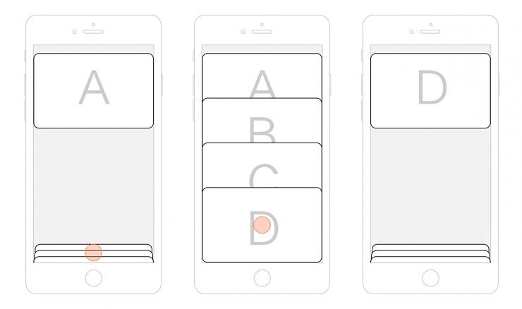
(Apple Pay Card scenario card steps)
Even if the user has only two cards case, still requires two steps:
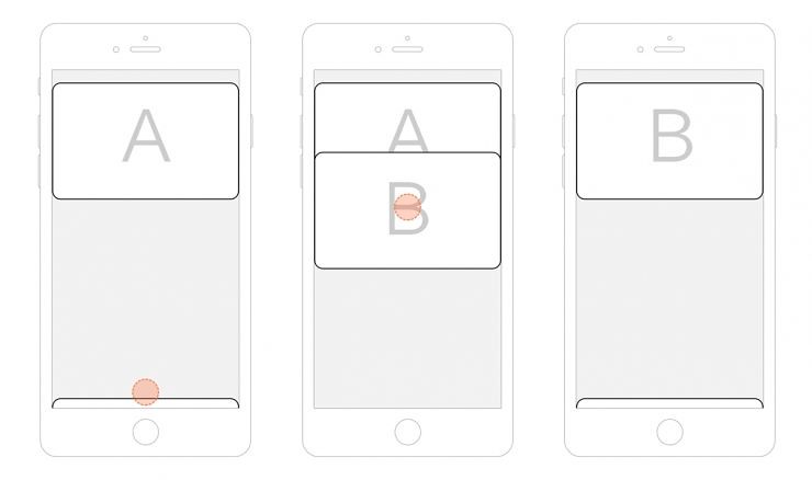
(Apple Pay two cards card steps)
Samsung Pay left adjacent to the switch on the card you only need one step to complete:
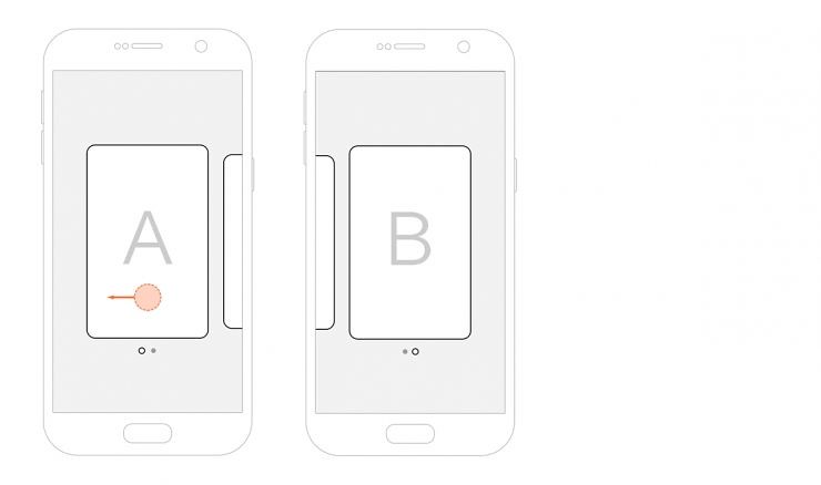
(Samsung Pay two cards card steps)
But Samsung Pay more than 3 cards on the switch is less efficient, and does not support the first and last cards cycle:
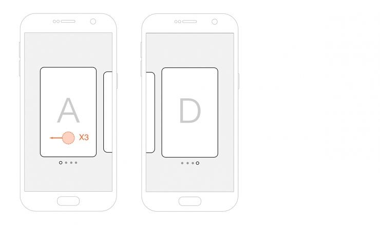
(Samsung Pay Card scenario card steps)
Apple Pay chekanovskogo interface card layout is consistent with the interaction with Wallet cards listing, Wallet cards listing has been designed to meet the payment of foreign habits other than bank cards more cards coupon, thus requiring a more efficient design of card switching.
While Apple Pay in the country may only show cards of bank cards rather than the more coupons, if not China UnionPay and banks ' own promotions, coupled with not many banks are currently support, tied card may be very limited in the number of users: for example, two (one for credit card and debit card), obviously the chekanovskogo efficiency is not optimal.
Official video from Apple, you can perhaps understand Apple's user pay scenarios, demand for chekanovskogo is not large, this might explain why Apple Pay equivalent of a conceptual model of payment bank cards.
Samsung Pay in chekanovskogo design is more suitable? On May 20, the Samsung Pay and PayPal co-operation in Samsung Pay chekanovskogo interface added QR cards PayPal, which greatly boosted Alipay scan code payment experience.
Because of the two-dimensional code scan codes payment and NFC payment are two different methods of payment, which is likely to become more frequent as a result of switching cards. But with the Samsung Pay gradually open its payment platform, if the future join the QR code card, such as app, Samsung Pay chekanovskogo efficiency is low with the increase in the number of cards.
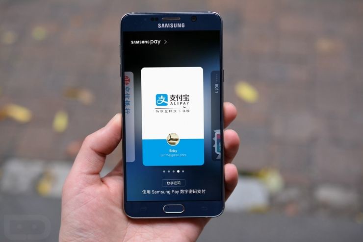
(Samsung Pay PayPal in two-dimensional code interface)
Collation
Chekanovskogo interface card-sorting Apple Pay and Samsung Pay is to add a card sort chronologically, rather than use, or most recently used history sorting.
The following figure, because Apple Pay default card concept, then each chekanovskogo is c, if you often switch between c and a, needs, list of chekanovskogo and Apple Pay was tied to expanded sorting order card A-B-C arrangement:
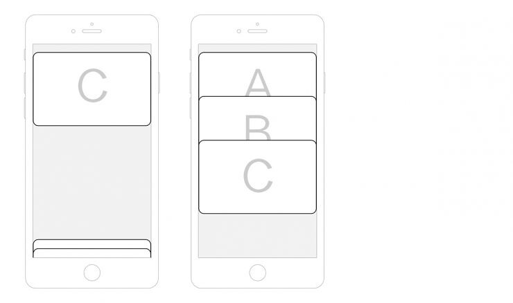
(Apple sort of Pay chekanovskogo interface)
Perhaps Apple Pay qiekalie form is to list remains consistent and Wallet card package. Similarly, users in the most frequently used card c and a switch between demand, Samsung Pay problems may be more obvious:
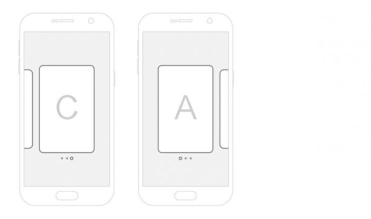
(Samsung Pay sort of chekanovskogo interface)
Samsung Pay chekanovskogo interface tied to sort is the default tab order, and there is no default card concept, it is possible to cut card has a greater impact on the efficiency.
Not negligible error exception
Mentioned Samsung Pay must be verified before you can close to the POS machine, otherwise contact POS can cause early POS machine error. Due to the cashier for NFC payments-related training than scanning code to pay less, the merchant-side error exceptions can easily cause the cashier's conflict, also effects may in turn have been waiting for paid users. Balenciaga iPhone 6s plus Case
At last
In any case, Apple Pay and Samsung Pay as representative of NFC payment compared to the scan code of payment does have a natural advantage, but these so-called advantages, PayPal and the huge "discount" and "rebate" activities before it is not so obvious.
And it is to this point "offers" and "rebate", the user may simply don't care about extra step during the operation, but instead to obtain a more tangible benefits and satisfaction, the user's habit has gradually developed, this actually is behind Samsung and Apple Pay Pay UnionPay and Alipay, the app wars.
Meanwhile, Alipay and the app is also trying to improve the scan code payment experience, being positive and hardware makers such as Samsung, Huawei, will sweep the yards to pay path to optimization. Predictable lines following the move to pay more competitive, NFC represented by Samsung and Apple Pay Pay pay them, with PayPal and micro-letters represented by line scanning code to pay has not been smooth.
Lei Feng network Note: reprints please contact authorize and be sure to include the author and the source, no deletion of content.

No comments:
Post a Comment